Simplicity can be attractive and a simple logo design often is most effective. Who agrees? A logo is the first thing people notice and recognise, making it an important asset and part of your brand identity. When creating the perfect logo for your uniforms, you’re not just designing a graphic but also crafting a symbol that represents who you are as a business. The goal is to communicate your brand’s message in a way that’s clear and memorable, so that anyone that sees your team in a branded uniform, instantly connects with your company and build a trust.
Whether your brand is printed on a jacket, embroidered on a shirt, or featured on a cap, a well-designed, logo guarantees that it is instantly identifiable. Logos that are complex may become difficult to read and lose detail. Overly complicated logos can lose detail and become hard to read. By focusing on simplicity, you can create a logo that looks professional, clean, and timeless, making your uniforms stand out in the best way possible and instantly recognizable in any setting. Whether your team is at an event or on the job, a strong logo helps create a sense of unity and leaves a positive impression on everyone who sees it. Now, let’s look at some key tips to help you create the best logo and position it on your uniforms for maximum impact.
Designing a Strong Logo for Uniforms

When designing a logo, it’s important to pick colours that truly reflect what your brand stands for. Colours send a message—blue is commonly associated with trust, professionalism, and calmness. This is why it’s often used by companies that want to come across as reliable, such as banks or healthcare providers. On the other hand, red represents energy, excitement, and action, which might be better for businesses that want to show passion and drive, like restaurants or sports brands. Before you decide on the colours for your logo, think about what your business stands for and what feelings you want to inspire in people when they see your brand. The right colours can help your logo stand out and make your business more recognizable to customers.
Another important part of designing a logo is picking the right font. You want a font that’s simple and easy to read. A clear and readable font will make sure that your logo is noticed quickly whether it’s stitched onto a uniform or printed on a sign. While fancy or decorative fonts might look attractive on a computer screen, they can be difficult to see when embroidered onto fabric. The small details of a complex font can get lost, making it harder for people to recognize your brand. By choosing a simple and straightforward font, you’re making sure your logo is easy to spot and read at a glance, no matter where it appears.
One more thing to think about is the complexity of your design. Detailed logo may look great on digital platforms or print materials, but when it comes to uniforms, especially embroidery, those details can get lost. Fabrics aren’t as smooth as paper or screens, and tiny lines or intricate patterns may not translate well. A straightforward design is more adaptable and will keep your logo looking sharp and professional no matter where it’s displayed. To have a nice logo design for your uniforms let’s just focus on simplicity and clarity.
Placing Your Logo on Uniforms
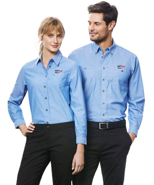
Now, let’s talk about where to put your logo on your team’s uniforms so it’s easy to see and helps your brand stand out. The most common spot is on the left chest.
This is a great place because it’s close to eye level and one of the first things people will notice. It’s a traditional and professional spot that works well for most uniforms. When your team interacts with customers or represents your company, having the logo in this area helps people recognise your brand right away.
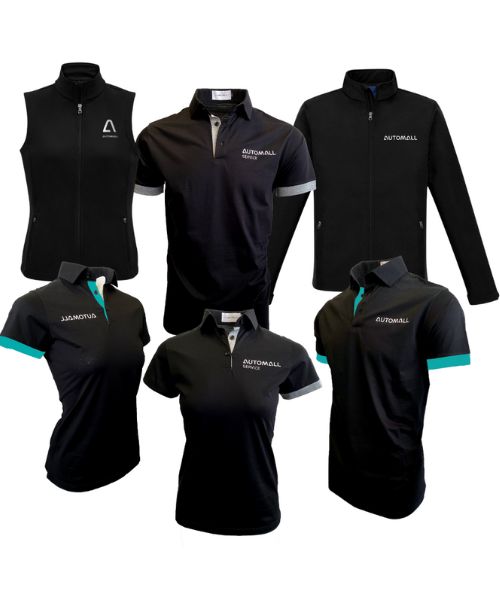
But you don’t have to stop there. You can also place the logo on the sleeves or the back of the shirt. Putting the logo on the sleeve adds a unique touch to your uniforms, giving them a modern look while keeping things professional. The back of the shirt is another option, placing the logo on the back is perfect for larger designs or roles where employees often have their backs to customers, like in restaurants or at events. This way, the logo is still prominently displayed, even if the employee isn’t facing the customer.
Accessories like caps, aprons, or jackets are also good places for logos. For example, adding a logo to a cap can make your team look uniform without needing to brand every single piece of clothing. These small touches help extend your brand’s visibility, especially in jobs where extra gear is needed, such as hospitality or retail.
For more detailed or colourful logos, Direct-to-Film (DTF) printing is a great option. Unlike embroidery, which works best with simple designs, DTF printing lets you use full-colour graphics and more details. This is perfect if your brand has a fun or creative logo that you want to stand out. DTF printing makes it easier to add bright, bold designs to your uniforms, helping your team get noticed.
Whichever method you choose, make sure the logo placement complements the garment’s design while keeping your brand front and center. By carefully selecting where and how your logo appears, you can create a cohesive and professional look for your team that reinforces your brand identity.


