Have you noticed how fashion is becoming louder than ever! It feels like we’ve kind of reverted to the 80’s again, mixing in so many eras of fashion where anything goes. Like power clashing, which is trending big time! The purpose of this blog is give you a little inspiration and confidence to jump out of your fashion comfort zone.
Not too many years ago showing your bra, sneakers with dresses or oversized clothing was deemed a fashion faux pas. Now breaking those rules is on trend! However one place the rules still apply are in a formal setting or at the workplace, but even these rules have lightened over the past decade.
One way you can still express yourself and unique style at work is through power clashing. Mixing multiple prints, shapes and textures seems a bit much, but if done right can look very polished. To indulge in this trend you will have to take off your minimalism hat for a day. Below are some controversial colour combos you can rock.
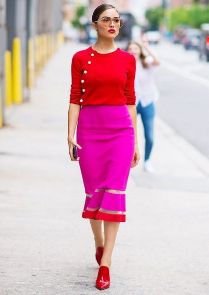 Pink and red
This is one of the hottest combos of the season! Whether it’s the popular millennial pink or hot pink with bright red. Don’t hesitate. Just wear it proud.
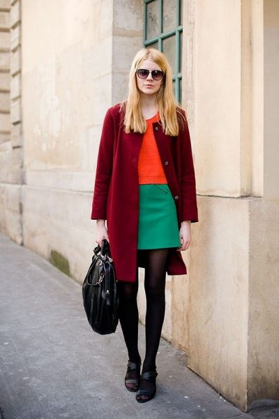 Red and Green
Move over Christmas, because we love this combo right now! An easy way to wear these two colors is by adding in patterns, neutral accessories, or metallic embellishments.
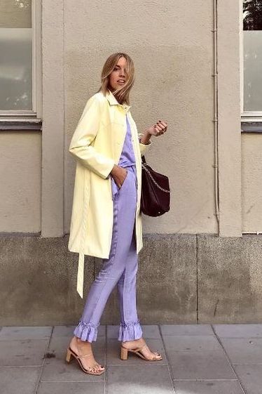 Purple and Yellow
This isn’t just for cheerleaders! Wear it all over, or just as an embellishment or accessories. This color combo is great for making a powerful and feminine statement.
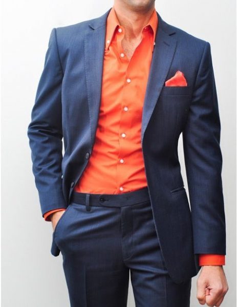 Navy and Orange:
This one is easy and you may already rock this look regularly. It looks great as solids or patterns. If you’re going to do some rainbow styling look at how these street style stars do it online. Use one or two colours to pop with a neutral or go all bright and bold. You’ll know when to stop.
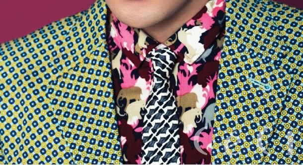
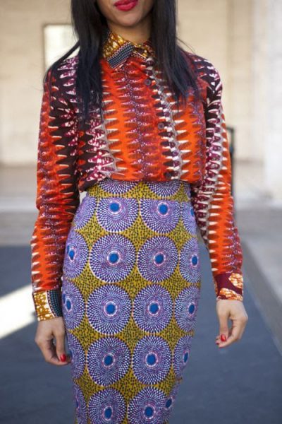 Patterns
Stripes, checks, plaids, polka dots, florals is what we’re talking. Also, animal prints are back this season. All kinds. You can have a lot of fun with this. The best advice before going in to the deep end is to consider pairing patterns that incorporate the same colour palette to keep the outfit feeling cohesive.
For example team two or three patterns and also mix in a plaid, but try to use three complimentary hues in the same family of colours(i.e. soft pink, brown and cream) for all the prints. to help pull the outfit together.
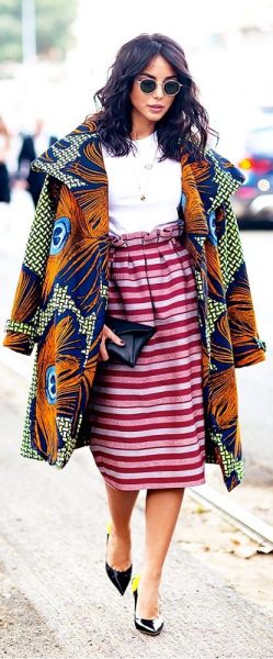 Let one print dominate
If you are wearing a bold, floral top, clash it with another print that is smaller in scale, say a polka dot, or an even smaller print floral. That way there’s a great miss-match but it’s not confusing for the eye.
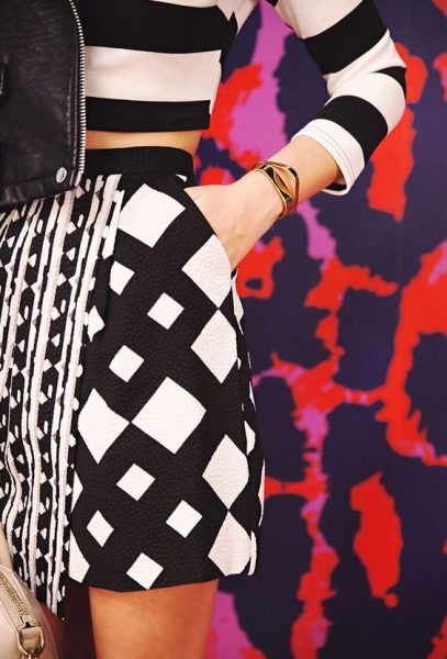
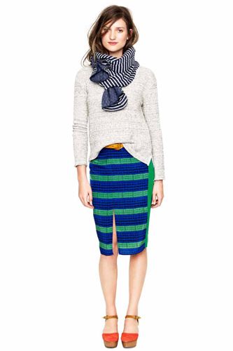
Use stripes and plaids as neutral 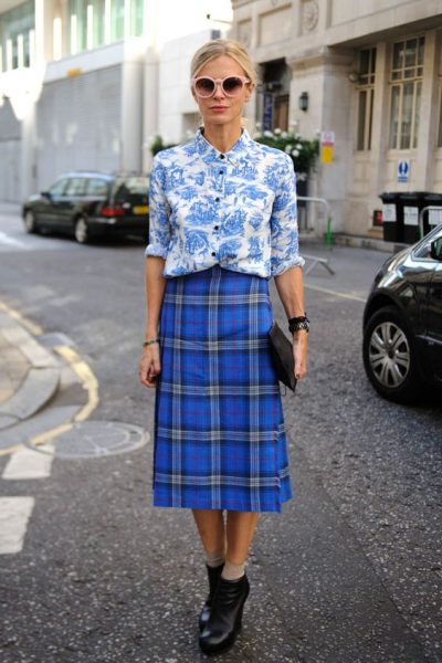
Pair your traditional stripe button-up top with a floral maxi skirt or printed pant and you’ll see.
 Play with texture
The main rule is to have fun with it, if something makes you feel good, it probably also looks good.
For more on colours check out our Colour Theory Page
Main featured image by Dapper Q
